Teaser
The Teaser component is designed to guide users to other pages within the site or to external pages. It allows for enhanced descriptions of the link target by combining the link with a heading, descriptive text, and an image.

Best practice
Teaser in full width, always use background colour


Teasers in Layout container 1-1


Teasers in Layout container 1-1-1
Keep text in teasers short and concise to avoid design issues with excessive text.
Do

Don't

To achieve the correct design, always apply a background color to the component when the layout option is set to full width.
Do

Don't

Do
- When placing your teasers with image in the Layout component, you should use the layout options 1-1 or 1-1-1.
Layout 1-1
Layout 1-1-1
Don't
- Do not use the layout options 2-1 or 1-2 when you have an image in the teaser.
Avoid using text in images as it may become blurry when resized or zoomed, affecting accessibility.
Do

Don't

Configuration in AEM
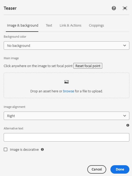
Background color
Option colors are:
- Apricot
- Light Turquoise (Mist)
- Pink (Thistle)
- There is also an option with no background
Note: Do not use the no background option for full-width teasers.
Main image
- Add an image and choose a cropping option 5:3 ratio. Learn more about images. (ADD LINK HERE)
Focal point
- Click anywhere on the image to set a focal point.
Image alignment
- Right (default)
- Left
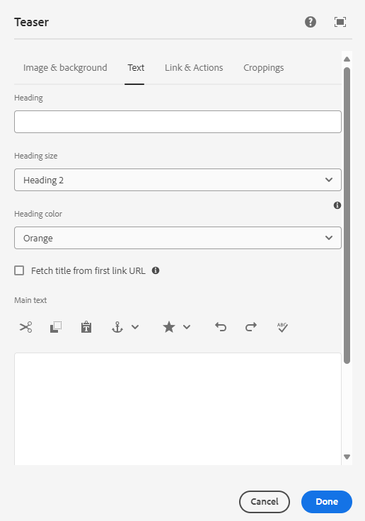
Heading
- Enter the heading text (mandatory).
Heading size and colors
- Heading 2: Orange
- Heading 3: Orange or Bark
Fetch title from first link URL
If checked, the title from the first link added under the Link & Actions tab will be shown automatically.
Main text
- Insert text.
Fetch text from first link URL
- If checked, the text from the first link added under the Link & Actions tab will be shown automatically, based on the description in page properties.
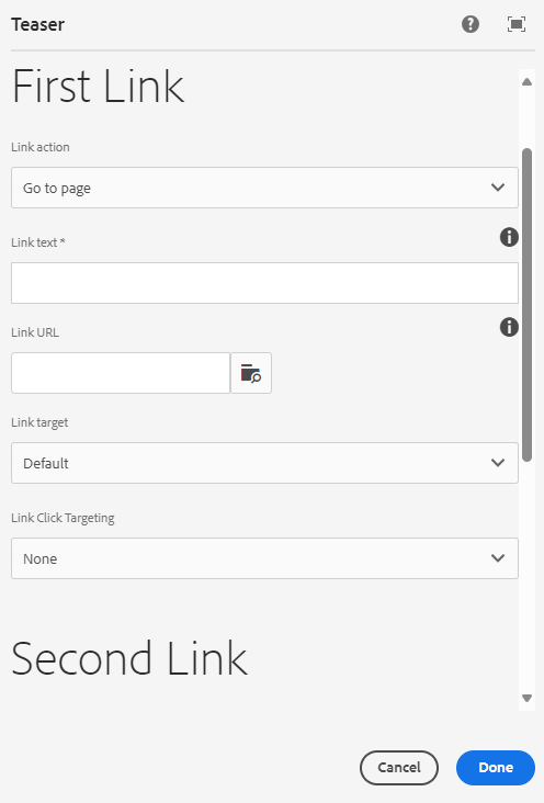
First link
- Link action
- Link text
- Link url - it is mandatory to have one link.
- Link target
- Link click targeting, none (default) or CTA.
Second link
- Link action
- Link text
- Link url
- Link target
- Link click targeting, none (default) or CTA.